BEHIND THE CURTAIN /
/ BOOKER’S PINK
PINK // Beyond the Bleed
Booker sought a label redesign for its Grenache blend Rosé, a best-seller in the winery’s tasting room. The winemaker, perhaps in defiance of typical approach to Rosé, actually adds some red wine to this wine.
Yeah yeah yeah. In making Rosé, red color seeps off of the skins for a little while and then you stop the process before the wine hits full-blown Red. But then, to add some Syrah after all that? Trippy. There’s more to that story.
A little background
Booker, a biodynamically farmed winery in Paso Robles, California, is well respected in the industry for its premium Rhône wines at the $80+ price point. Eric Jensen, founder and winemaker, primarily focuses on dense, powerful reds earning 95-100 points year after year that qualitatively compete with Napa cult wines going for four times the price. He begrudgingly makes some white wine too... and Rosé. He treats it like he treats his reds in the cellar, and it seems to be paying off. The vineyard only releases one white wine per year (it's called, succinctly enough "White") and has been the highest scoring white in the Paso Robles AVA for years. "Pink", the winery's only Rosé, reliably sells out in the tasting room after every release — usually just in time for dinner guests to bring something good home for Thanksgiving.
While the red offerings, with inventive names like "Ripper", "Fracture", and "Vertigo", were each lavished with unique branded visual identities long ago, Pink had been left behind.
“Why I make a pink wine is beyond me, but Chelsea makes me and everyone else seems to like it.”
That’s from Booker’s website copy, but to quote the winery’s General Manager Chelsea Sprague more contemporaneously: “It’s a man making pink wine that doesn’t want to make pink wine.”
…After scraping by with the original label artwork from the winery's inception in 2005, it was finally time to give Pink some love for the 2018 bottling: time for a redesign.
Eric's Notes from the Pink tech sheet [specs for the sales team and distribution machine]: "There are 10,000 pink wines that are made to have very little color, lots of acid, low alcohol and low flavor. This is not that Pink. Mostly made from Grenache, it usually sees 5 days on the skins so the color is about 1-2 days away from being a full red wine. This is a grown man, masculine pink."
And at 15.2% alcohol?
“That’s a STRONG Rosé.”
And now for the process study. Let me count the ways.
At the beginning of a rebrand, I generally prefer to cast a wide net. The strategy tends to emerge naturally from exploratory conversations with the client… and a few sleepless four-o’clock-in-the-mornings.
/ CONCEPT 1 / Beyond the bleed
Here comes the part about the bleeding color. I won’t show you what this looked like in the beginning stages cause it’s not as good. My portfolio, my choice.
Some look at the artwork and see color bleeding off of the skins of the fruit, and that’s ok. But I was mainly inspired by the idea of adding the Syrah in there at the last minute... dropping it in like a Hail Mary. I still can’t quite wrap my head around that. The best way I can explain it is that Eric really, really really doesn’t like having to make Rosé, so instead he makes a light Grenache and then to seal the deal he throws some red wine in there just in case. It’s a MASCULINE PINK. If such a thing exists, this is IT. And like it or not, people love it.
Ok. Maybe I’ll give you just a little something from my initial experimentation on this one:
/ CONCEPT 1 / Continued
/ CONCEPT 2 / Choke hold
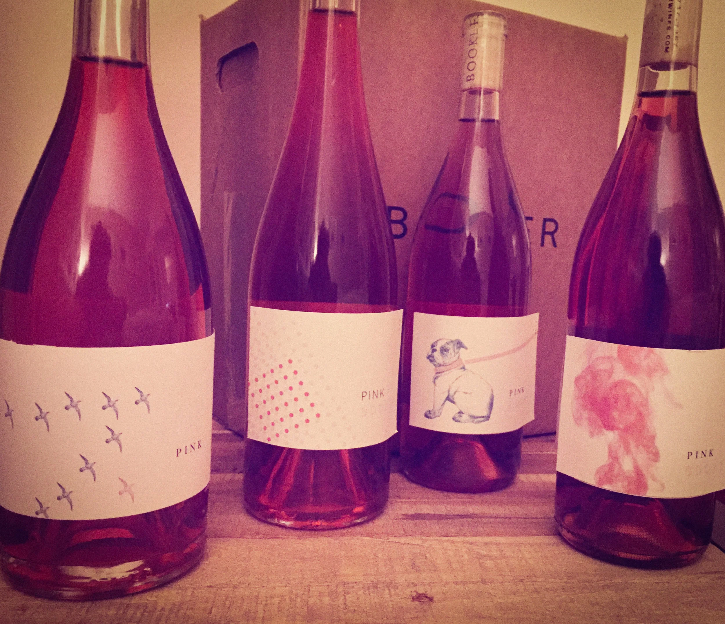
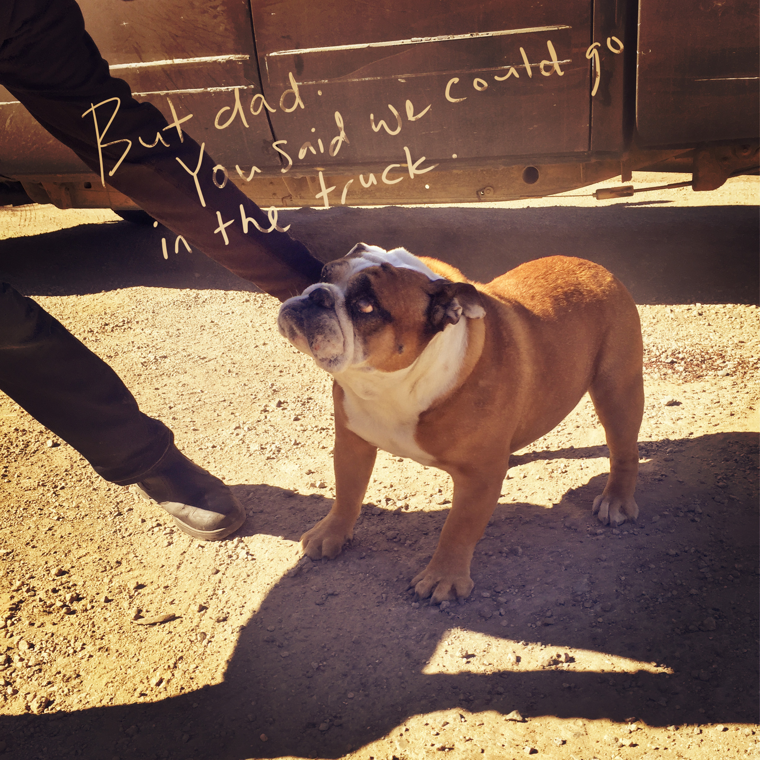
Ok so there's Brutus that hangs out at the winery all the time. He's adorable, obviously. He doesn’t want to not get to ride in the truck, almost as much as Eric doesn’t want to have to make Pink wine.
/ CONCEPT 3 / Outlier
Let’s be real. Booker is a serious winery.
…But can Pink be the ugly duckling? Dinner guests migrating home for Thanksgiving say yes.
/ CONCEPT 4 / Geometric
This one's pretty simple: Pretty.
The 90 degree angles echo the curves of the hillsides where Booker’s grapes are grown, each row attended to manifest a specific purpose. Some of those rows are Pink.
Earlies Lineup
Brutus was a very, very close second. He made it all the way to the last round.
There’s a truism in wine: animals sell.
And everybody loves Brutus. I mean, look at him. A staple at the tasting room, he sneakily gets under feet, licking the salt off of any bare legs and gracing us all with the occasional flatulence. Not so great for the fragrant nuance of wine tasting, but resignedly charming. Eric had always wanted to find a way to get Brutus on a wine label, and luckily I didn’t know about that until I’d stumbled upon the stubborn bulldog as a metaphor for Eric’s general reluctance to make Rosé. Maybe it’s just me and I know it’s more than a little silly, but if the seed of a concept has been planted by the client, it feels a little like cheating. (Don’t panic. Of course the best concepts are inspired by the client, but they shouldn’t have to be the ones pitching ideas).
So, in this case, I could take some comfort in the purity of the idea, if only for the sake of my own pride. And anyway, the dog’s awful cute. But, as sometimes happens throughout the course of a design process, the story behind the dog got slowly watered down. First, he was digitized. Then, he got a more traditional type treatment. Then, he lost his pink leash. Then his pink collar. Then he got smaller. Then, he was placed in the center of the layout of a very traditional Bordeaux dieline. And it was the last design stage: time for a decision. Do we keep him?
I’m not sure where we lost the magic along the way, but it just didn’t look like he was struggling anymore. Lisa and I stood in the Jensen kitchen on a grey mid-December afternoon, observing the latest mockups. We paused and blinked at one another. Why did we put a dog on a wine label again?
Without the story coming through, it’s nothing but shamelessly gratuitous. I can’t take advantage of Brutus that way.
Luckily we had another pan hot in the fire.
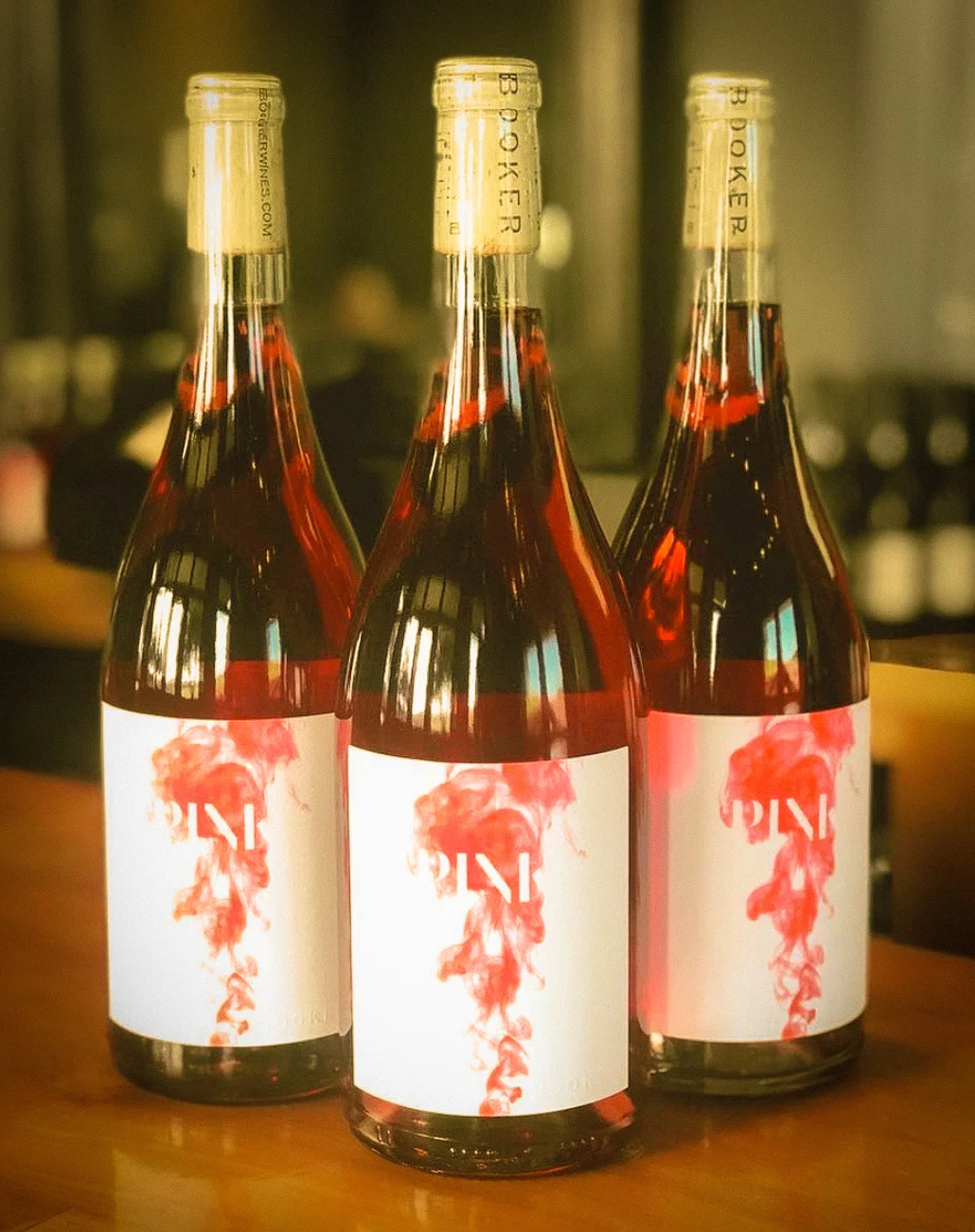
The final design was actually born of the very first idea that I’d had for the project, sitting in the Jensen’s livingroom at the official kickoff meeting. It seemed too easy — the first idea is almost never the right one. But I have to remind myself: don’t discount an idea just because it’s not SUPPOSED to be the right one. Every idea has to stand up on its own two feet, and if it survives? It must have been made of sturdier stuff. And sometimes, you just get lucky.
The bleed is deceptively simple: yes, it’s pink. It’s modern, it's striking, without taking itself too seriously. Well, maybe a little bit. It’s sexy without being too feminine. It speaks to the winemaking process so it’s got something for the wine nerds, without being overbearingly so. And, best of all, we get to get creative with the sculptured emboss on the photography. Mmmmm.
In the weeds
Package design features a sculptured emboss on photography (source: Getty Images). This is not intended to inspire the perception of ink sitting on top of the page, which could easily lean heavy-handed: rather, the emboss exists with the explicit purpose of providing physical definition to the typography. "PINK" is reversed out of the emboss back to paper level, giving the letters a tactile beveled edge while retaining the original felt texture of the label paper stock in the body of the lettering.
All of the letterforms may not necessarily be instantly recognizable, emerging from the flowing color and forcing the mind to fill in the gaps. The viewer is only shown what is chosen to be revealed, the rest merely hinted at. Perhaps hesitation at the word... Pink. And when you do make the connection, it can be a satisfying discovery: this wine demands participation.
"BOOKER" is blind embossed (raised round) on the lower right corner, tying the wine into the established branding system of the winery's family of estate offerings.
“It almost looks like a light Pinot.”
It’s always tricky business, using the color of the wine on the label. Color changes vintage to vintage, and in this case unabashedly so. Eric absolutely refuses to put himself on a leash when it comes to the blend mix, body and color of a single wine year-over-year. The winemaker reacts to what the grapes are doing out in the field, which changes each year with the weather.
And Eric never lets the tail wag the dog. The color on the packaging has to be complex enough to allow for some dramatic shifts in the color of the wine itself. And anyway, next year he might throw in some Mourvèdre, too.
Living coral to deep, almost obscene ruby. The label color will never, ever match the wine. So let the colors coexist, symbiotically complementing one another: feeding off of each other without getting in the other’s way. It’s a tall order, involving more than a little prognostication… and plenty of rope.
“There are 10,000 pink wines that are made to have very little color, lots of acid, low alcohol and low flavor. This is not that Pink.”


